学习教育
Invisible Details
A course on the invisible details of interface design: the timing, weight and small decisions that separate good software from great.
费用未确认EducationNew tool
费用、限制与支持平台
已确认字段由提交者按所附官网来源核对,日期见各字段。套餐及限制可能变化,请以官网当前条款为准。
- 费用类型
- 未确认
- 免费额度
- 未确认
- 使用限制
- 未确认
- 支持平台
- 未确认
关于这个工具
A course on the invisible details of interface design: the timing, weight and small decisions that separate good software from great.
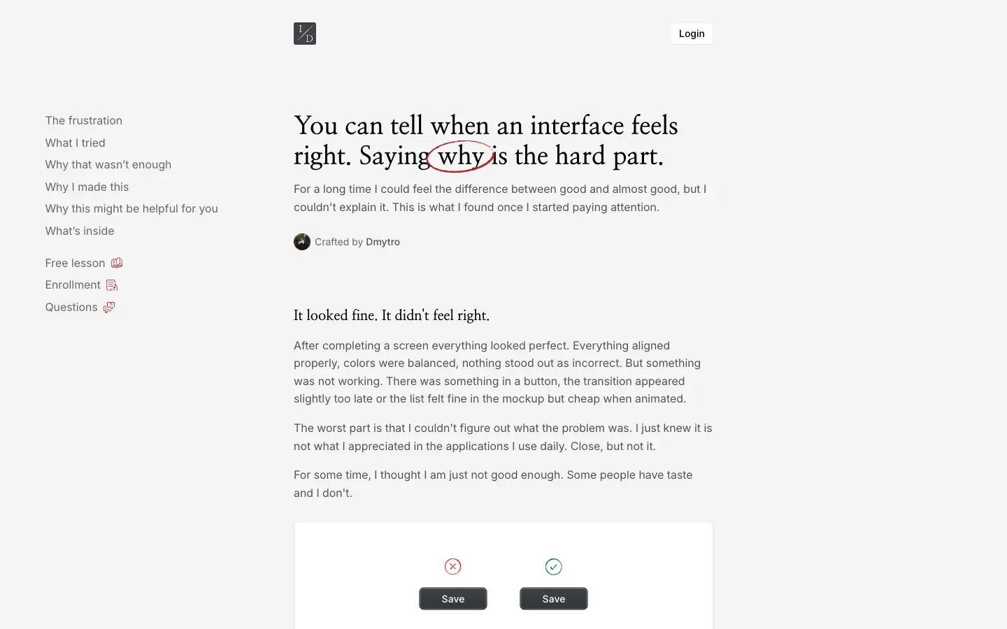
For a long time I could feel the difference between good and almost good, but I couldn't explain it. This is what I found once I started paying attention.
After completing a screen everything looked perfect. Everything aligned properly, colors were balanced, nothing stood out as incorrect. But something was not working. There was something in a button, the transition appeared slightly too late or the list felt fine in the mockup but cheap when animated.
The worst part is that I couldn't figure out what the problem was. I just knew it is not what I appreciated in the applications I use daily. Close, but not it.




评论 0
正在加载评论…